Thank you for reading this post, don't forget to subscribe!
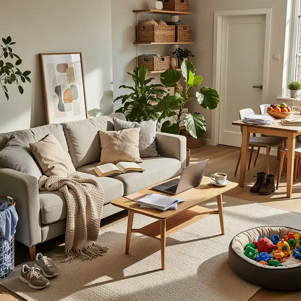
You’ve probably looked around your living room lately and thought, “Ugh, this place looks tired.” Maybe the paint’s looking a bit sad. Maybe that couch you loved five years ago now makes you cringe. Or maybe you just saw your neighbor’s freshly decorated home and now yours feels like it’s stuck in a time warp.
We’ve all been there.
The thing is, figuring out when and how to redecorate can feel overwhelming. There’s so much advice out there. So many rules. So many Pinterest boards that make you feel like you need a design degree just to pick throw pillows.
Here’s the good news: it doesn’t have to be complicated.
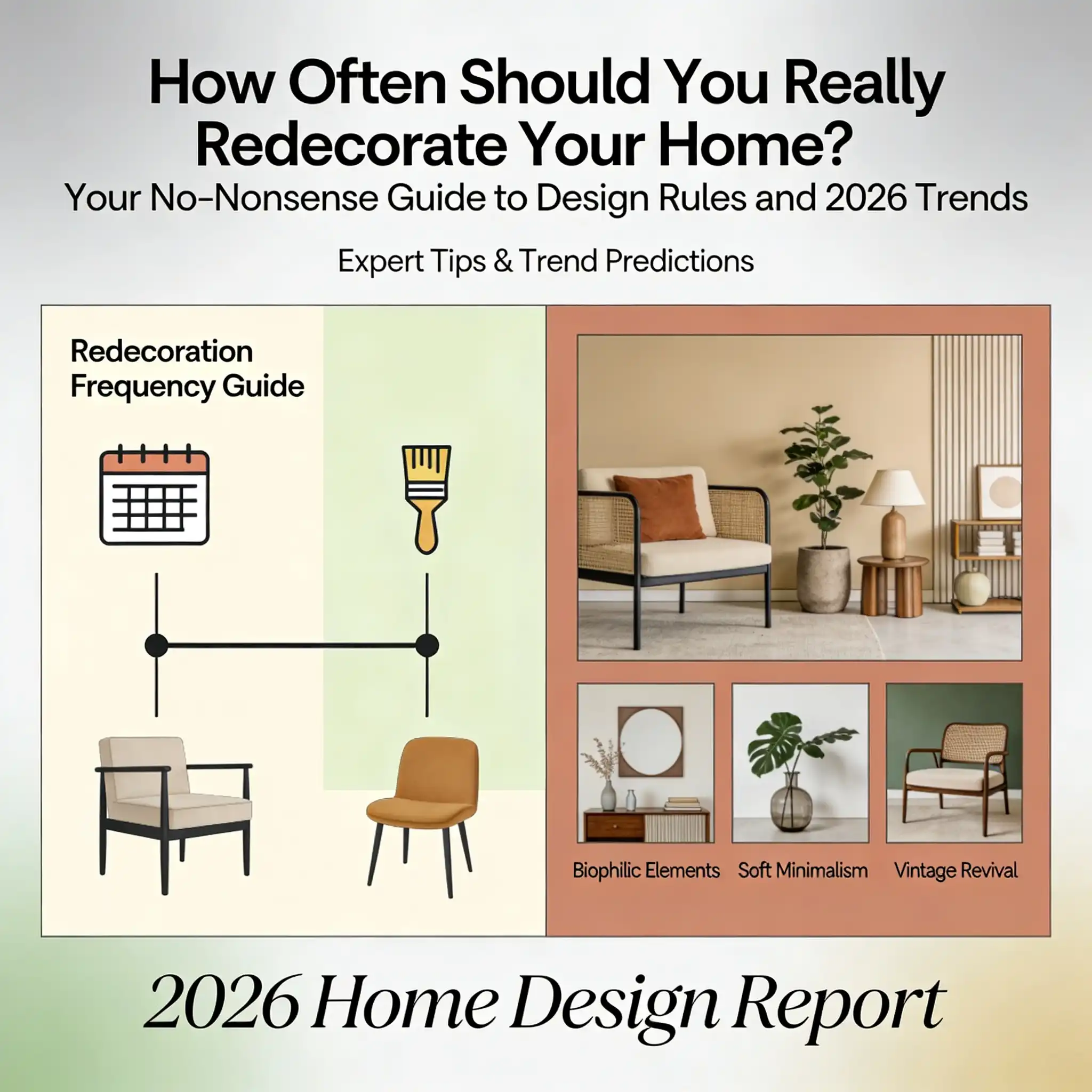
In this guide, I’m going to break everything down in plain English. We’ll talk about how often you should actually redecorate (spoiler: there’s no one perfect answer). We’ll cover those design rules you’ve heard about but never quite understood. And we’ll peek at what’s trending in 2026 so your home feels fresh and current.
No fancy jargon. No confusing formulas. Just real, practical advice you can actually use.
Ready? Let’s dive in.
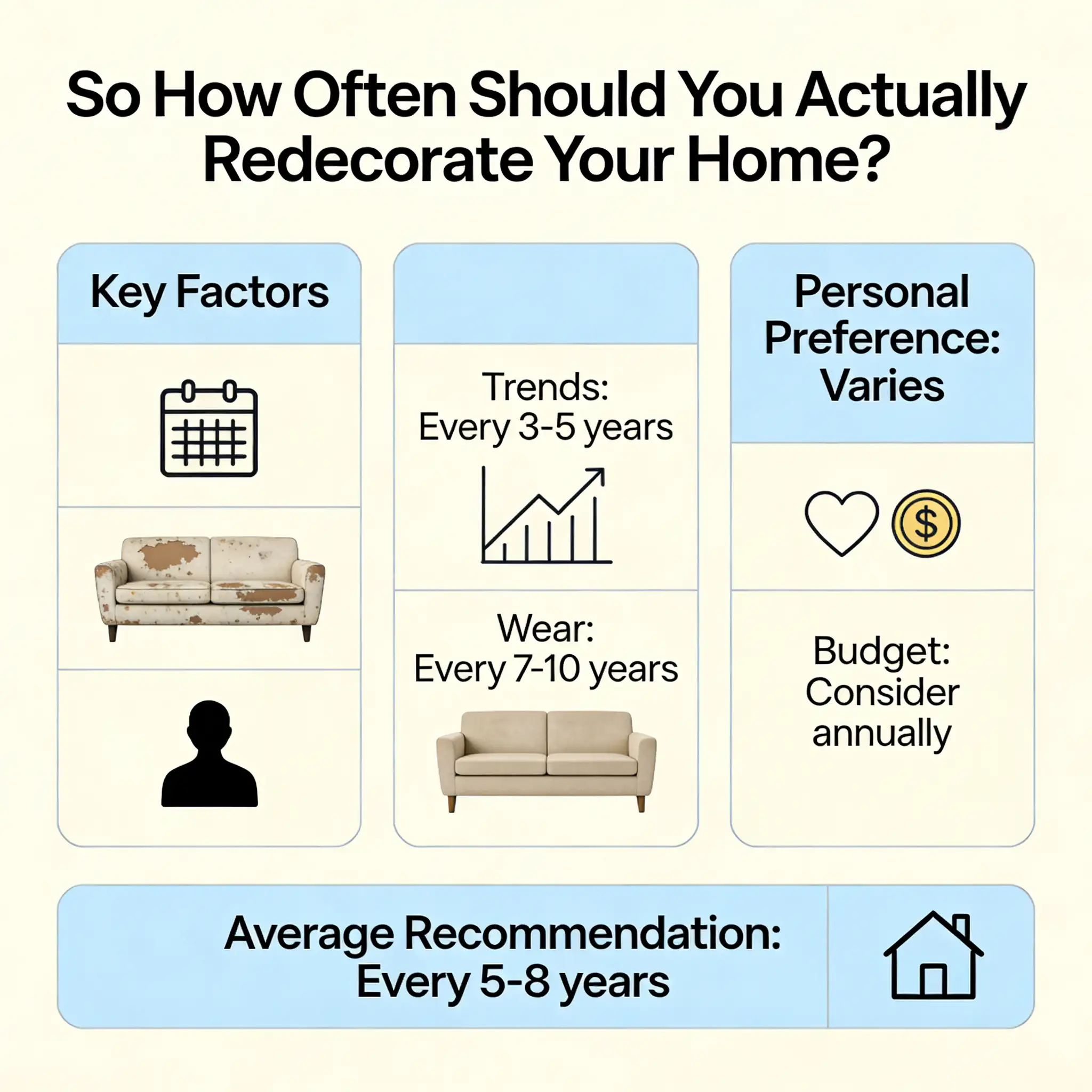
Okay, here’s the million-dollar question. How often does a house really need redecorating?
The short answer? Most experts say every 5 to 7 years for a full refresh.
But here’s the thing – that’s just a general guideline. Your home isn’t like everyone else’s. Your life isn’t like everyone else’s. So your redecorating timeline won’t be either.
Think about it this way. A young couple with no kids might keep their home looking fresh for a decade without much effort. But a family with three little ones and a couple of dogs? That home’s going to show wear and tear a lot faster.
It’s not about following some strict schedule. It’s about paying attention to your space and knowing when it needs some love.
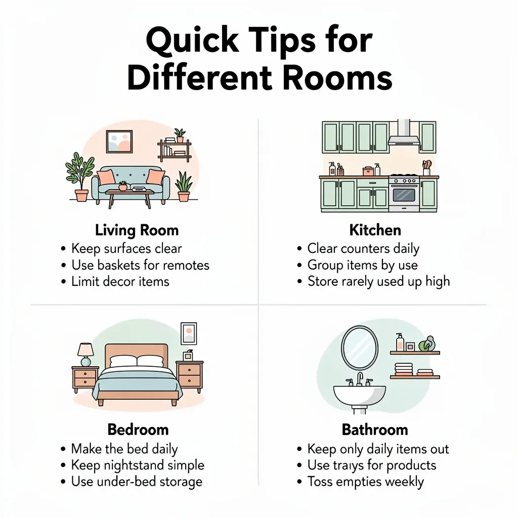
Different Rooms Need Different Attention
Here’s something people don’t always realize – not every room in your house ages at the same rate.
Your Living Room
This is probably where you spend most of your time. You watch TV here. You hang out with friends here. Your kids probably destroy it here on a daily basis.
Because it gets so much action, your living room usually needs a refresh every 5 to 7 years. But here’s a little secret – you can keep it feeling fresh by just switching up the small stuff every couple of years. New throw pillows. A different rug. Some updated art on the walls.
These little changes can make a big difference without costing you a fortune. Check out our guide to affordable room updates for some ideas.
Your Kitchen
Kitchens are tricky. They’re expensive to renovate fully, but they also get a ton of use.
For big stuff like cabinets and countertops, you’re looking at updates every 10 to 15 years. But smaller refreshes – new hardware, updated light fixtures, a fresh coat of paint – can happen every 5 years or so.
The good news? Little kitchen updates can make a huge impact. Sometimes just changing your cabinet pulls and adding some new lighting makes the whole space feel brand new.
Bathrooms
Similar deal to kitchens. Major renovations every 15 to 20 years. Minor freshening up every 5 to 7 years.
Keep in mind that bathrooms deal with a lot of moisture, which can speed up wear on paint and fixtures. So keep an eye on things like peeling paint or outdated faucets.
Bedrooms
Adult bedrooms are pretty low-maintenance. You can usually go 7 to 10 years between major updates.
Kids’ bedrooms? That’s a different story. Little ones grow fast, and their tastes change even faster. Plan to update their spaces every 3 to 5 years.
Home Office
With so many of us working from home these days (hello, 2026!), home offices have become way more important. Aim to refresh your workspace every 4 to 6 years to keep it functional and inspiring.
After all, you’re spending 8+ hours a day in there. It should make you feel good, right?
Signs It’s Definitely Time to Redecorate
Forget the timelines for a second. Sometimes your home just tells you it’s time for a change. Here are some dead giveaways:
You walk in and feel… nothing. Or worse, you feel annoyed. Your home should make you happy. If it doesn’t, something needs to change.
Things are visibly worn. Chipped paint. Faded curtains. Scratched-up furniture. Stained carpet. These aren’t just ugly – they bring down the whole vibe of your space.
Your style has changed. Remember when you loved that rustic farmhouse look? Now it just feels dated. That’s okay! People grow and change. Your home should too.
You’re embarrassed to have people over. This is a big one. If you’re avoiding dinner parties because you don’t want anyone to see your place, it’s definitely time for an update.
You moved in and never really decorated. Some of us (no judgment here!) have been living with the same bare walls and random furniture for years. If that sounds familiar, consider this your sign to finally make your house feel like home.

If there’s one thing that can completely transform a room with relatively little money and effort, it’s paint.
But how often should you actually repaint?
Inside Your Home
For most rooms, repainting every 5 to 7 years keeps things looking fresh. But some spaces need more frequent attention:
Hallways and entryways get touched a lot. Hands on walls, furniture bumping around, shoes scuffing baseboards. These areas might need a new coat every 2 to 4 years.
Kitchens deal with grease, steam, and cooking splatters. Plan to repaint every 3 to 4 years.
Bathrooms are similar because of all the humidity. Every 3 to 4 years keeps them looking their best.
Kids’ rooms – well, you know how that goes. Between the crayon incidents and the sticky fingerprints, these rooms often need repainting every 3 to 5 years.
Living rooms and adult bedrooms can usually wait longer. 5 to 7 years is pretty standard, and if you’re careful, you might even stretch it to 10.
Outside Your Home
Exterior paint takes a beating from sun, rain, snow, and everything else Mother Nature throws at it.
How long it lasts depends on what your house is made of:
- Wood siding: Every 3 to 7 years
- Aluminum siding: Every 5 years or so
- Stucco: Every 5 to 6 years
- Brick: Every 15 to 20 years if it’s painted
- Fiber cement siding: Every 10 to 15 years
Climate matters too. If you live somewhere with harsh winters or intense sun, paint won’t last as long.
Making Your Paint Last Longer
Want to get more years out of your paint job? Here are some tips:
- Don’t skip the prep work. Clean those walls, fill those holes, and sand rough spots before you paint.
- Use primer. Yes, it’s an extra step. Yes, it’s worth it.
- Buy decent paint. You don’t need the most expensive stuff, but cheap paint won’t last as long.
- Apply it properly. Two thin coats beat one thick coat every time.
According to Consumer Reports, quality paint can last significantly longer than budget options – sometimes twice as long!

Here’s something a lot of people wonder about: is redecorating actually worth the money? Especially if you might sell your home someday?
The answer is yes – but some updates pay off better than others.
The Best Bang for Your Buck
Fresh paint is basically the best investment you can make. It costs relatively little but makes a massive impact. Some estimates suggest you can get 50% to 100% return on a paint investment. Not bad, right?
Kitchen updates – even small ones – tend to pay off well. According to Remodeling Magazine, minor kitchen renovations typically return 70% to 80% of what you spend. Even just updating hardware and lighting can make buyers (or you!) much happier.
Bathroom freshening brings back about 60% to 70% of your investment. New fixtures, fresh grout, and updated vanities make a real difference.
New flooring, especially hardwood, is another winner. You might get 70% to 80% back on that investment.
Curb appeal matters more than people realize. First impressions count. Updates to your front door, landscaping, and exterior paint can return 70% to 100% of costs.
Beyond Money
But here’s something worth mentioning: redecorating isn’t just about resale value.
Living in a home you actually enjoy is worth something too. Studies show that our environments affect our mood, stress levels, and even our sleep. A home that feels good can actually make you healthier and happier.
So don’t just think about what buyers might want someday. Think about what you need right now.

Okay, let’s tackle the stuff that usually makes people’s eyes glaze over. All those design rules with numbers and ratios.
I promise to make this painless.
The 60/30/10 Rule – The One Everyone Should Know
You’ve probably heard of this one. It’s the most famous color rule in interior design, and honestly, it’s pretty genius.
Here’s how it works:
60% of your room should be one main color. This is usually your walls, big furniture, and maybe a large rug. Pick something you won’t get sick of.
30% should be a secondary color. This shows up on things like curtains, accent chairs, smaller furniture, or bedding.
10% is your accent color. This is the fun pop of color in your throw pillows, artwork, vases, and little decorative bits.
Let me give you a real example. Say you’ve got gray walls and a gray couch (that’s your 60%). You add some navy blue curtains and a navy chair (that’s your 30%). Then you throw in some mustard yellow pillows and a matching vase (that’s your 10%).
Boom. Balanced, interesting, and easy to live with.
The 70/20/10 Rule – A Slight Variation
This is pretty much the same idea, just with slightly different numbers. You use more of your dominant color (70% instead of 60%) and less of your secondary color (20% instead of 30%).
This works great when you really love your main color and want it to dominate. It creates a calmer, more cohesive vibe.
The 80/20 Rule – Focus on What Matters
This one comes from something called the Pareto Principle, which basically says 80% of your results come from 20% of your efforts.
In decorating terms? Focus your budget and energy on the 20% of pieces that make 80% of the impact.
Translation: invest in a really good sofa instead of five okay accessories. Buy one amazing light fixture instead of a bunch of mediocre ones.
The key pieces in a room – the sofa, the bed, the dining table – define the whole space. Get those right, and everything else falls into place.
The 70/30 Rule – Function vs. Pretty Stuff
This rule is all about balance between practical and decorative:
70% of your room should be functional things. Furniture you actually use, lighting that helps you see, storage that holds your stuff.
30% can be purely decorative. Art, plants, decorative objects, that fancy vase you never put flowers in.
This keeps your room livable while still letting it look beautiful. Nobody wants a space that’s all function and no personality. But nobody wants a space so filled with decorative stuff that you can’t actually sit anywhere, either.
The 60/40 Rule – Patterns and Solids
When it comes to fabrics and patterns in a room:
- 60% should be solid or neutral
- 40% can be patterned or textured
This keeps your room from feeling chaotic. You can absolutely mix patterns – florals with stripes, geometric with organic shapes – but having a solid foundation keeps things grounded.
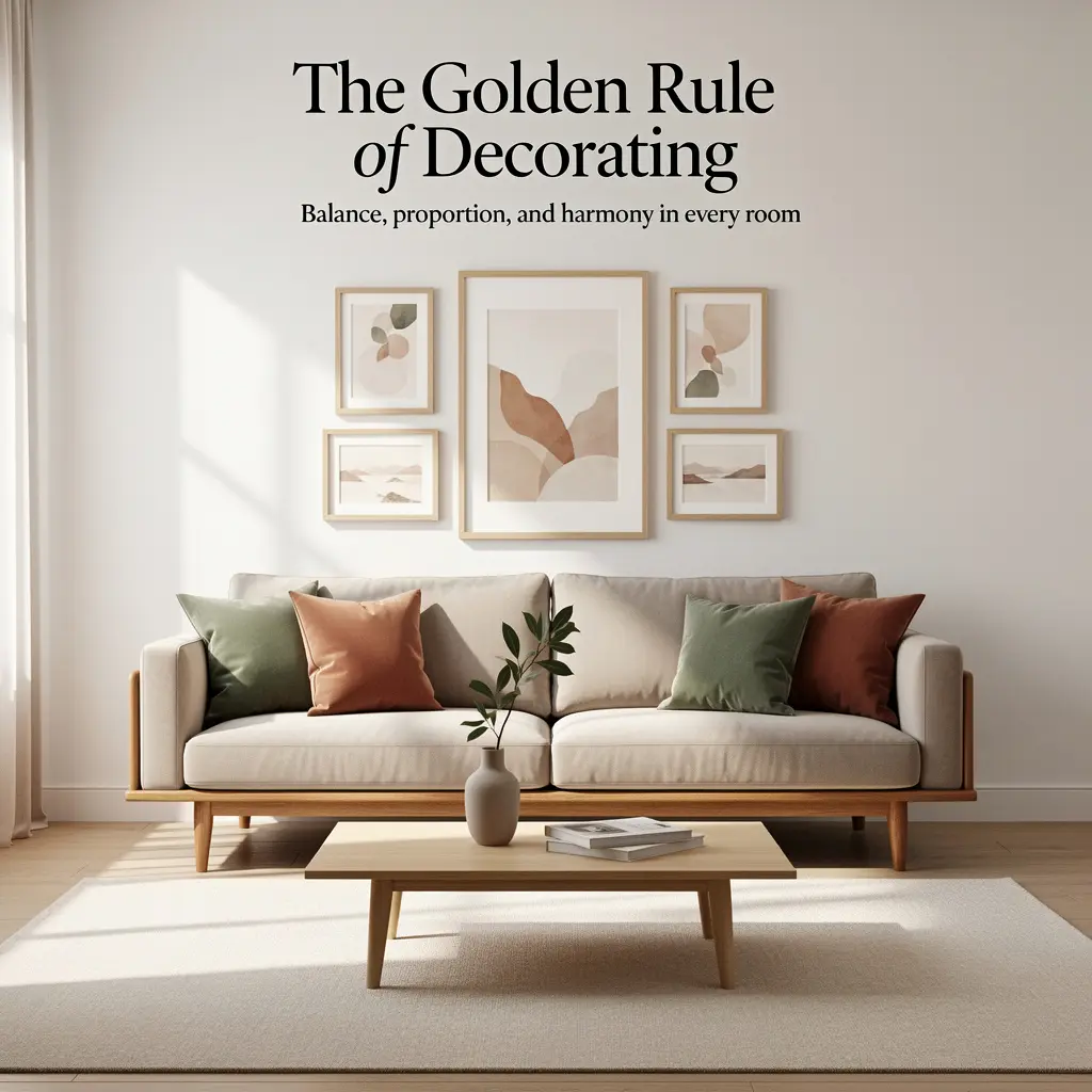
The Golden Ratio – Don’t Panic, It’s Easy
The golden ratio sounds scary and mathematical. But it’s actually really simple to use.
It’s approximately 1 to 1.6. And you don’t need to do any math.
Here’s the practical version:
For furniture placement: Don’t shove your couch against the wall. Pull it about one-third of the way into the room. This creates better flow and makes the space feel more intentional.
For hanging art: The center of your artwork should be at eye level – about 57 to 60 inches from the floor. When hanging art above furniture, it should be about 6 to 8 inches above the piece.
For coffee tables: Your coffee table should be about two-thirds the length of your sofa. So if your sofa is 90 inches, aim for a coffee table around 60 inches.
For rugs: Your rug should be big enough that at least the front legs of all your seating furniture can sit on it.
See? Not so scary.
The Triangle Rule – Easy Arrangement Trick
When you’re arranging stuff on shelves, mantels, or tabletops, think in triangles.
Put three objects of different heights together so that imaginary lines connecting them would form a triangle. Tall vase on the left, medium candle in the middle back, short decorative box on the right.
This creates visual interest and balance. It looks intentional without looking forced.
The Rule of Three – Odd Numbers Are Your Friend
Our brains find odd numbers more interesting than even numbers. Weird, right? But it’s true.
So when you’re arranging decorative items, group them in threes. Three throw pillows. Three candles. Three pictures on a wall.
For larger arrangements, you can go to five or seven. Just keep it odd.
This works for pretty much everything. Shelf styling. Gallery walls. Table centerpieces. Even accessorizing outfits, honestly.
The 3-5-7 Rule – Taking It Further
Building on the rule of three, this guideline suggests grouping items in threes, fives, or sevens.
- Three items for smaller surfaces
- Five items for medium-sized spaces
- Seven items for larger areas
It’s a great framework when you’re not sure how many objects to use in a display.
The 2:3 Wall Rule – Getting Art Size Right
Here’s a super helpful one: artwork (or a gallery arrangement) should take up about two-thirds of the wall space above your furniture.
So if you have a 6-foot-wide sofa, your art should span about 4 feet.
Too-small art above big furniture looks like an afterthought. Getting the proportion right makes the whole arrangement look deliberate and designed.
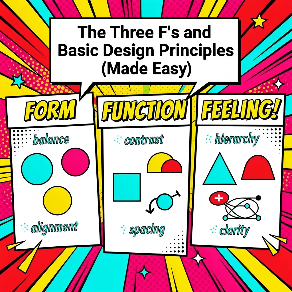
The Three F’s of Interior Design
Every good room balances three things. Designers call them the three F’s:
Function – Does the room work for what you need it to do? Can you actually cook in your kitchen? Is your living room comfortable for watching TV? This always comes first.
Feel – How does the room make you feel when you walk in? Calm? Energized? Cozy? This is about the mood you’re creating through lighting, colors, and textures.
Form – This is the actual look of the space. The style, the colors, the shapes, the pretty stuff. It’s what most people think of when they hear “interior design.”
The magic happens when all three work together. A beautiful room that doesn’t function well is useless. A functional room with no personality is boring. You need all three.
The 7 Principles Every Designer Uses
Designers talk about seven basic principles. Here they are in normal-person language:
1. Balance
Make sure visual weight is distributed evenly. If you’ve got a big heavy couch on one side of the room, put something substantial on the other side too.
2. Harmony
Everything should feel like it belongs together. Your colors should relate to each other. Your styles should be consistent (or at least intentionally mixed).
3. Rhythm
This is about movement. Repeating colors, shapes, or patterns throughout a room creates flow. Your eye should move naturally around the space.
4. Proportion and Scale
Stuff should be the right size for the space. A tiny coffee table in front of a massive sectional looks weird. A huge dresser in a tiny bedroom overwhelms everything.
5. Emphasis
Every room needs a star – a focal point. Maybe it’s a fireplace, a big window, or a statement piece of art. Let one thing take center stage.
6. Contrast
A little bit of difference makes things interesting. Light against dark. Smooth against textured. Hard against soft. Without contrast, rooms feel flat.
7. Details
The little things matter. Nice trim on your curtains. Interesting hardware on your cabinets. A carefully arranged stack of books. Details show care.
For more on applying these principles, check out Architectural Digest’s design guides.
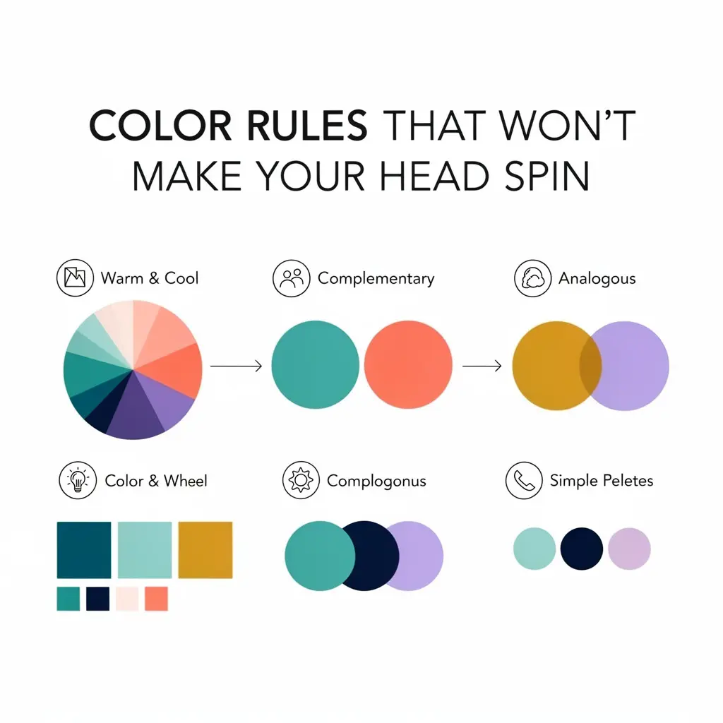
How Many Colors Should You Use?
The 2-color rule is perfect for minimalists. Pick one neutral and one accent, and use them throughout the room in different proportions. White and navy. Gray and blush. Beige and forest green. Simple, sophisticated, hard to mess up.
The 3-color rule is what most designers use. One dominant, one secondary, one accent. Like we talked about with the 60/30/10 rule. This gives you enough variety to be interesting without getting chaotic.
How Many Is Too Many?
In a single room? Aim for three to five colors maximum.
Throughout your whole house? Five to seven coordinated colors that flow from room to room.
The key is intentionality. Every color should have a reason for being there. If you can’t explain why you chose it, it might be creating visual noise.
Making Colors Work Together
Here are some quick tips:
Stick to an undertone family. Colors are either warm (yellow, orange, red undertones) or cool (blue, green, purple undertones). When you mix both randomly, things feel off. Pick one temperature and stick with it.
Use different saturations. You can use lots of blues in one room if they’re different intensities – navy, sky blue, pale blue. The variety keeps things interesting.
Let your floors guide you. Your flooring is probably going to be there a while, so let its tone inform your color choices.
Test before you commit. Paint samples on your walls. Live with them for a few days. See how they look in morning light and evening light. Colors change dramatically depending on the light.
Our whole-house color guide goes deeper on this topic if you want more help.

Let’s talk about what NOT to do. Because sometimes knowing what’s wrong is just as helpful as knowing what’s right.
Pushing all your furniture against the walls.
I know, I know. It feels like it opens up the room. But it actually makes spaces feel empty and cold, and creates awkward conversation distances. Pull furniture in toward the center. Create cozy groupings. Let your furniture breathe.
Only using overhead lighting.
That ceiling light is fine, but it’s not enough. Rooms need layers of light – table lamps, floor lamps, maybe some candles. Different light sources at different heights create warmth and dimension.
Matching everything too perfectly.
When your throw pillows match your curtains which match your rug which match your picture frames… it looks like a catalog. Or worse, a hotel. Mix things up. Let pieces look collected over time.
Choosing looks over comfort.
That beautiful but rock-hard chair? Nobody’s going to sit in it. That stunning white couch when you have kids and a dog? Recipe for constant stress. Your home needs to be livable first.
Hanging art too high.
This is maybe the most common mistake. Art should be at eye level – the center about 57 to 60 inches from the floor. Not way up near the ceiling where you need binoculars to see it.
Forgetting about texture.
A room with all smooth, hard surfaces feels cold and unwelcoming. Add softness with rugs, throws, pillows, curtains. Mix rough with smooth, matte with shiny.
Following every trend blindly.
Trends can be inspiring, but your home should reflect YOU, not what some magazine says is hot this year. Pick the trends that actually resonate with your life and skip the rest.
Overcrowding the space.
More isn’t always better. Every room needs some breathing room. White space lets your good pieces shine. Edit ruthlessly.
Ignoring function for beauty.
A gorgeous bookshelf that doesn’t actually hold your books is pointless. A pretty kitchen where you can’t prep food is frustrating. Always start with how you’ll use the space.

Alright, let’s peek at what’s trending this year. Because staying current is fun, and knowing what’s outdated helps you avoid decorating regrets.
The Big Picture for 2026
The overall vibe for 2026 is warm, personal, and sustainable. We’re moving away from perfectly curated, Instagram-perfect spaces toward homes that feel genuinely lived-in and loved.
Organic modernism is huge. Think clean, simple lines but with warmth from natural materials. Wood, stone, clay, linen. Contemporary shapes softened by earthy textures.
Collected character is replacing everything-new-at-once decorating. Mixing vintage finds with contemporary pieces. Incorporating inherited items. Letting your home tell a story over time.
Bringing nature inside continues to grow. More plants, more natural light, more organic materials. Living walls, big windows, views of greenery. The line between inside and outside is getting blurrier.
Sustainability is no longer optional. People want eco-friendly materials, local craftsmanship, and things that last. Quality over quantity.
What Colors Are In for 2026?
The gray era is officially over. Finally!
Warm neutrals are taking over as background colors. Think creamy whites, soft beiges, mushroom tones, warm taupes. Cozy instead of cold.
Earthy tones are everywhere. Terra cotta, ochre, olive, rust, spice colors. These warm shades make homes feel nurturing.
Moody depths add drama. Forest green, midnight blue, chocolate brown. Rich and sophisticated.
Muted accents are replacing bright pops. Instead of neon tangerine, we’re seeing burnt orange. Instead of hot pink, dusty rose. Instead of emerald, sage.
Kitchen Cabinet Colors for 2026
Warm wood tones are back in a big way. Natural oak, walnut, and cherry. Real wood grain brings warmth and character.
Deep greens continue to be popular. Forest green, hunter, sage – anything that connects to nature.
Warmer whites are replacing crisp, cold white. Cream, ivory, linen, and antique white feel softer.
Two-tone kitchens are still going strong. Darker lowers with lighter uppers. Contrasting islands. It adds depth and interest.
Flooring Trends for 2026
Wide-plank hardwood in warm tones is the most popular choice. European oak, white oak, and walnut lead the way.
Sustainable options like bamboo, cork, and reclaimed wood appeal to eco-conscious homeowners.
Natural stone – limestone, travertine, slate – brings organic luxury to kitchens, bathrooms, and entryways.
Patterned tile is making a comeback in specific areas. Encaustic tiles, terrazzo, geometric patterns add personality without overwhelming.
What’s Happening with Accent Walls?
Accent walls aren’t dead, but they’re evolving.
Instead of just painting one wall a different color, 2026 accent walls feature:
- Textured finishes like limewash, Venetian plaster, or textured paint
- Natural materials like wood paneling, stone, or tile
- Architectural details like molding or built-ins
- Subtle color shifts instead of dramatic contrast
Lighting Trends for 2026
Lighting is getting more interesting and more intentional.
Sculptural fixtures are becoming focal points. Chandeliers and pendants that are basically art.
Warm light is in. Cool-white LEDs are out. We want that cozy, amber glow.
Smart lighting is becoming standard. Voice control, circadian rhythm programming, app customization.
Mixed metals look sophisticated. Brass with black, bronze with nickel, copper with chrome.
What’s Out in 2026?
Some things are definitely past their prime:
- The all-gray everything look – too cold, too dated
- Overly distressed farmhouse – barn doors, “gather” signs, and galvanized metal decor
- Super matchy-matchy rooms – we want collected, not catalog
- Minimalism without personality – stark is giving way to warm
- Fast furniture – quality matters more than ever
What Styles Are Coming Back?
Everything old is new again:
Art Deco touches – geometric patterns, luxe materials, glamorous details
1970s vibes – warm colors, curved furniture, natural textures, bold patterns
Traditional elements – crown molding, built-ins, classic furniture shapes
Thoughtful maximalism – more color, more pattern, more personality (but done intentionally)
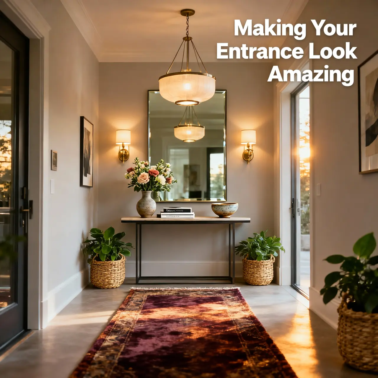
First impressions matter. And the first impression of your home happens at the front door.
What’s Trending for Entrances in 2026?
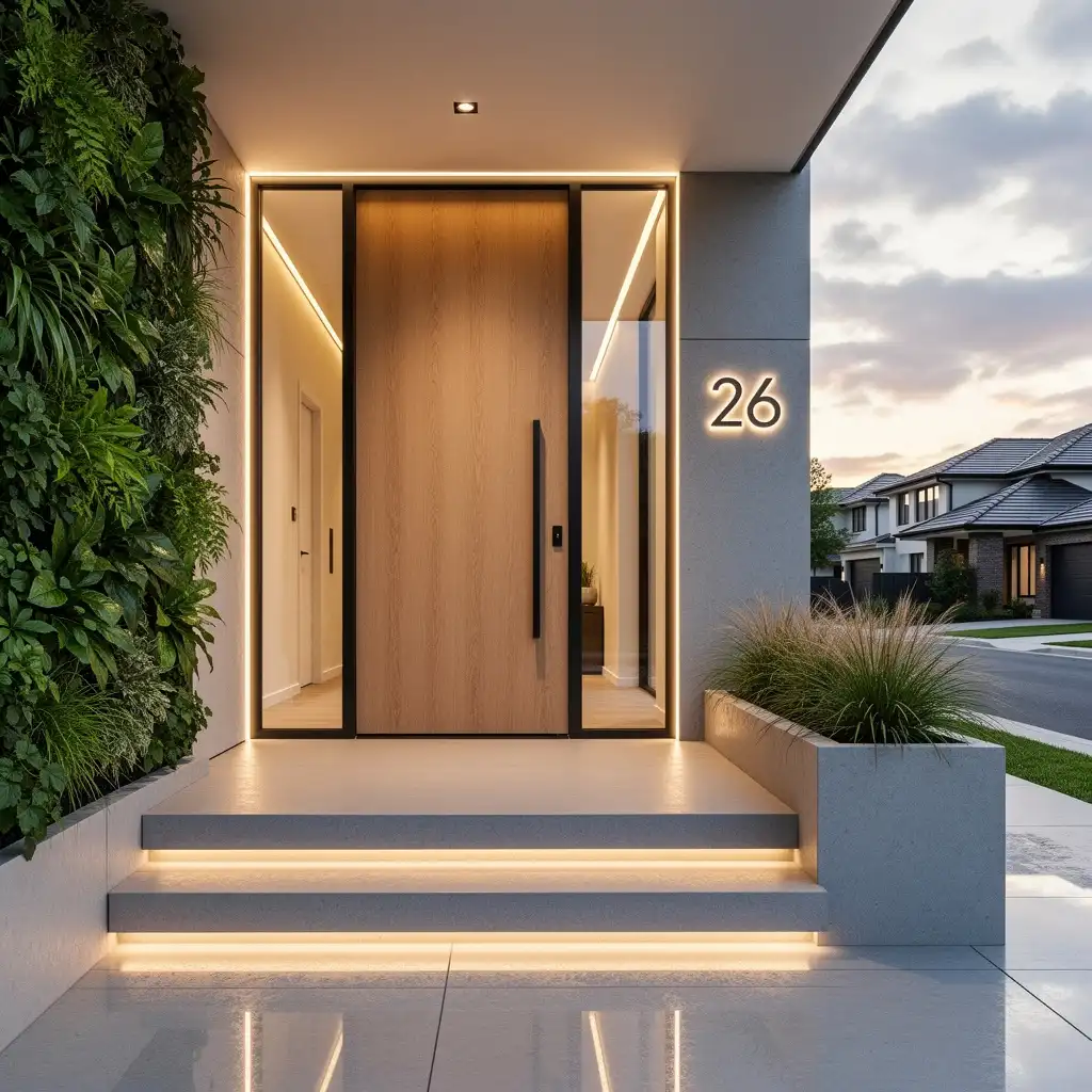
Clean lines with warmth. Modern architecture softened by natural materials. Think simple designs with wood, stone, and greenery.
Intentional lighting. Smart lights that turn on automatically, light pathways safely, and make your home feel welcoming at night.
Statement doors. Bold colors, interesting hardware, distinctive styles. Your front door should have personality.
Low-maintenance landscaping. Architectural plants, clean beds, and greenery that doesn’t require constant fussing.
Where to Get Great Outdoor Planters
Quality planters can really elevate your entrance. Here are some good sources:
For investment pieces: Restoration Hardware and West Elm have beautiful, substantial options.
For mid-range: Target, Pottery Barn, and HomeGoods offer style without breaking the bank.
For unique finds: Etsy and local pottery studios have one-of-a-kind handmade pieces.
For budget-friendly: Home Depot, Lowe’s, and Amazon have tons of options at every price point.
When picking planters, think about your climate (will they crack in winter?), drainage, size relative to your entrance, and style match with your home.
Smart Lighting for Your Front Door
Some popular options:
Ring Video Doorbell – lighting, camera, and intercom all in one
Philips Hue Outdoor – great color options and smart home integration
Lutron Caseta – reliable, professional-grade smart switches
Look for automatic dusk-to-dawn sensors, motion activation, and compatibility with whatever smart home system you use.

For high-traffic entrances, you need something durable:
Coir (coconut fiber) – great for scraping dirt, natural look, works best under a covered porch
Rubber – super durable, handles all weather, easy to clean
Recycled materials – eco-friendly and tough
Pro tip: Layer a functional scraper mat underneath a pretty decorative mat. Best of both worlds.
Size matters too. Your mat should span most of the door width and give room for two comfortable steps.
House Numbers and Signs
Custom house numbers add personality and curb appeal. Some good sources:
Modern styles: House Number Lab and Rejuvenation
Unique handmade options: Etsy has tons of choices from individual makers
Classic looks: Pottery Barn, Ballard Designs, Frontgate
Budget picks: Amazon, Wayfair
Think about visibility from the street, whether you need lighting for them, durability in your climate, and how they match your home’s style.
Seasonal Door Decor
Wreaths and door hangers add personality:
Year-round basics: Boxwood, eucalyptus, or simple greenery wreaths work in any season
Seasonal swaps: Update for spring flowers, summer vibrancy, fall harvest, and winter holidays
DIY option: Making your own is fun and budget-friendly. Pinterest is full of ideas.
Porch Furniture That Lasts
For entrance seating and furniture that can handle the elements:
Teak – the gold standard, weathers beautifully, lasts forever
All-weather wicker – looks natural but handles moisture and sun
Powder-coated metal – aluminum and steel with quality finishes resist rust
Concrete and stone – basically indestructible
Check out our porch furniture guide for more detailed recommendations.
Popular Front Door Colors for 2026
The color of your front door makes a big statement. Here’s what’s trending:
Black – timeless, sophisticated, works with everything
Navy blue – welcoming and elegant
Forest green – natural feeling, warm, distinctive
Warm red – classic and inviting
Cream or warm white – fresh and clean
Sage green – soft, natural, very 2026
Pick something that complements your exterior colors but stands out enough to make an impression.
How Often Should You Redo Your Bedroom?
Your bedroom should be your sanctuary. Plan for a major refresh every 7 to 10 years, with smaller updates along the way:
Bedding – fresh sheets, duvet covers, and pillows every 2 to 3 years
Paint – every 7 to 10 years (bedrooms usually stay pretty clean)
Mattress – definitely replace every 7 to 10 years for health and comfort
Accessories – update lamps, art, and decor whenever your taste changes
If you’re not sleeping well or the room doesn’t feel restful, that’s a sign to make some changes regardless of the timeline.
Living Room Love
Since it’s your most-used space, your living room needs regular attention:
Upholstery – get professional cleaning every year or two. Consider replacing or recovering upholstered pieces every 10 to 15 years.
Coffee tables and wood furniture – quality stuff lasts forever with care. Refinish as needed.
Rugs – rotate yearly for even wear. Replace every 5 to 10 years depending on quality.
Window treatments – clean annually. Replace every 7 to 10 years.
Kitchen and Bath Basics
These functional spaces need regular love:
Hardware updates – new pulls and faucets can transform these rooms affordably. Do it every 5 to 7 years.
Countertops – depending on material, expect 15 to 25 years. Laminate wears faster than stone.
Tile – good tile lasts decades, but grout might need refreshing every 10 to 15 years.
Cabinets – refinishing or repainting extends their life a lot. Full replacement usually happens every 15 to 25 years.
If there’s ONE thing to remember from this entire article, let it be this:
Design for how you actually live. Not how you think you should live. Not how spaces look in magazines. How YOU really live.
This is the golden rule every great designer follows.
It means asking honest questions. Do you actually use that formal dining room, or does everyone hang out in the kitchen? Will you really keep that white sofa clean with your lifestyle? Does that reading corner make sense if you don’t really read at home?
Great design serves real life. It understands your routines. It supports what you actually do. It makes everyday moments more comfortable and more beautiful.
All those rules and ratios we talked about? They’re tools to help you create spaces that work. But the ultimate goal is always the same: a home that fits YOUR life.
So as you think about your next decorating project, start by observing. Watch how you and your family actually move through your home. Notice where you naturally gather. Pay attention to what frustrates you about your current setup.
Then design solutions for YOUR reality. Not someone else’s vision of what your home should be.
Wrapping It All Up
So there you have it – everything you need to know about redecorating your home in 2026.
Here’s the quick version:
How often to redecorate? Generally every 5 to 7 years for most rooms, but trust your gut. When your home stops feeling good, it’s time for a change.
Those design rules? They’re helpful guidelines, not strict laws. The 60/30/10 color rule, the rule of three, the triangle rule – they all work because they help create balance and interest. Use them as starting points.
2026 trends? Warm over cool. Natural over synthetic. Collected over catalog. Personal over perfect.
Most important thing? Make your home work for YOUR life. Function, feel, and form – in that order.
You don’t need to tackle everything at once. Start with one room. Or one corner. Or honestly, just a fresh coat of paint and some new pillows.
Small changes add up. Before you know it, you’ll have a home that makes you smile every time you walk through the door.
And isn’t that the whole point?
What’s your next project going to be? Drop a comment below or share your transformations with us on social media. We’d love to see what you create!
This guide was written in 2026 and reflects current design trends and recommendations. Design keeps evolving, so bookmark this page and check back for updates!