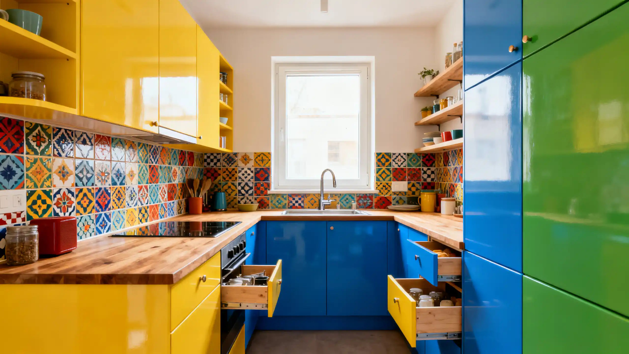
1–6: Colorful Kitchen Ideas for Apartments and Small Spaces
1. Peel-and-Stick Backsplash That Feels Permanent
For colorful kitchen ideas apartment dwellers can actually use, peel-and-stick tile is powerful.
Thank you for reading this post, don't forget to subscribe!
Brands like Smart Tiles and FloorPops (available via https://www.homedepot.com) make removable options that look shockingly real.
Try:
- Deep blue Moroccan pattern
- Terracotta geometric
- Glossy emerald subway tile
Why it works:
You’re adding color at eye level without touching cabinets.
Step-by-step:
- Clean backsplash thoroughly.
- Measure carefully.
- Start from center line outward.
- Use a level.
It transforms white or brown cabinets instantly.
2. Two-Tone Cabinets Without Replacing Cabinets
You don’t need new cabinets.
Paint just the lower cabinets.
Leave uppers white.
For example:
White uppers + deep blue lowers = visual balance.
According to color psychology research summarized on https://www.psychologytoday.com, blue tones create calm and trust. That matters in a busy kitchen.
This works beautifully in:
- Small galley kitchens
- Apartments with white cabinets
- Narrow layouts
3. Bright Blue Lower Cabinets in Tight Layouts
Colorful kitchen ideas blue are trending — but bright doesn’t mean loud.
Try:
- Navy for depth
- Dusty blue for softness
- Teal for energy
In a 9×7 kitchen I redesigned, we painted only base cabinets navy and swapped hardware for brass from https://www.ikea.com.
Total cost under $400.
It looked custom.
4. Open Shelving With Bold Back Panels
Remove two upper cabinet doors.
Paint the interior backing:
- Mustard yellow
- Soft sage
- Coral
Instant pop. Minimal commitment.
Great for colorful kitchen ideas for small spaces because it adds depth without crowding.
5. Colorful Kitchen Rugs That Define Zones
In apartments, floors are often dull tile.
Add:
- A washable runner from https://ruggable.com
- A bright Turkish-style rug
- A geometric modern runner
It warms the room and anchors color.
Bonus: Completely renter friendly.
6. Painted Kitchen Cart for Extra Storage
Small kitchens lack storage.
Buy a simple cart from https://www.target.com or https://www.ikea.com.
Paint it:
- Bright green
- Matte black
- Cobalt blue
Now it’s storage and statement.
7–12: Bright and Bold Styles That Don’t Feel Overwhelming
7. Bright Bohemian Layers
Colorful kitchen ideas bright bohemian aren’t about chaos.
They’re about layering:
- Wood shelves
- Patterned tile
- Plants
- Mixed metals
Add open shelves with trailing plants like pothos (care tips via https://www.gardeners.com).
Keep cabinets neutral. Let accessories carry the color.
8. Bright Eclectic Cabinet Mix
Colorful kitchen ideas bright eclectic work best when there’s a common thread.
Example:
- White cabinets
- One emerald pantry door
- Gold hardware
- Patterned backsplash with matching green
Repetition keeps it intentional.
9. Colorful Kitchen Ideas With White Cabinets
White cabinets are a gift.
They reflect light.
Add:
- Bold backsplash
- Bright bar stools
- Painted island
White acts as balance.
Benjamin Moore’s color tools at https://www.benjaminmoore.com help visualize combinations.
10. Bright Farmhouse Contrast
Colorful kitchen ideas bright farmhouse don’t have to be all white.
Try:
- Sage green cabinets
- Butcher block counters
- Black hardware
The warmth of wood balances color.
Wood tone inspiration: https://www.woodmagazine.com
11. Wood Cabinets With Unexpected Color
Colorful kitchen ideas wood cabinets can feel tricky.
If cabinets are brown:
Don’t fight them.
Pair with:
- Warm terracotta walls
- Deep blue backsplash
- Cream counters
Brown + blue is timeless. Even design archives on https://www.architecturaldigest.com show this pairing often.
12. Modern Color Blocking
Colorful kitchen ideas modern work best with clean lines.
Try:
- Matte flat-front cabinets
- One bold color wall
- Minimal decor
No clutter.
Color becomes architecture.
13–18: Specific Color Stories That Work in Real Homes
13. Blue Kitchens That Feel Calm
Blue works in apartments.
It reflects light like water.
Best shades:
- Navy (dramatic)
- Sky blue (airy)
- Slate (modern)
Balance with warm wood or brass.
14. Brown Cabinets Made Lively
Colorful kitchen ideas brown cabinets require contrast.
Add:
- Light backsplash
- Brass hardware
- Cream walls
- Warm pendant lighting
Dark cabinets + warm light = inviting, not heavy.
Lighting basics explained clearly by https://www.energy.gov.
15. Yellow Accents in Neutral Spaces
Not full yellow cabinets.
Instead:
- Yellow kettle
- Bar stools
- Artwork
Small doses prevent overwhelm.
16. Green Cabinets in Small Kitchens
Green is surprisingly forgiving.
Sage in small spaces feels soft.
Deep forest feels rich.
According to color theory basics explained on https://www.canva.com/colors/color-wheel/, green balances warm and cool tones.
17. Pink Done Grown-Up
Dusty rose. Not bubblegum.
Pair with:
- Black fixtures
- Marble counters
- Soft wood
It feels modern.
18. Black + Bright Contrast
Black lowers. Bright backsplash.
It grounds the space.
Especially effective in colorful kitchen ideas apartment layouts with open shelving.
Step-by-Step: How to Add Color Without Regret
- Start small (backsplash, rug, island).
- Test paint samples first.
- Observe color morning and night.
- Balance bold with neutral.
- Repeat color at least twice in the room.
That’s the rule designers follow.
Real-Life Scenarios and Smart Decisions
Scenario 1: Rental apartment with white cabinets.
Solution: Blue peel-and-stick tile + washable runner + gold hardware swap.
Scenario 2: Small kitchen with brown cabinets.
Solution: Cream walls + brass handles + blue accessories.
Scenario 3: Modern condo with flat white cabinets.
Solution: Paint island green + minimal decor + wood stools.
Each under $1000.
Mistakes People Make When Trying Color
- Painting everything bold
- Ignoring lighting temperature
- Mixing too many undertones
- Skipping test swatches
- Forgetting balance
Color isn’t about bravery.
It’s about proportion.
Why Color Works — When You Do It Right
Color changes mood.
It changes how small spaces feel.
It makes rental kitchens feel owned.
And when layered thoughtfully, it doesn’t shrink a space — it adds depth.
That’s the difference between copying Pinterest and actually designing your kitchen.
Color should feel like you live there.
Not like you staged it.


